The Brief
MixBox is a new subscription service ready to conquer the market. Think HelloFresh, but for cocktails. They deliver curated monthly or bi-monthly boxes filled with everything needed to craft innovative cocktails at home, complete with recipes created by expert mixologists. Set to launch in Antwerp in summer 2025, MixBox has ambitious plans for multi-city expansion.
As the lead designer, my challenge was to create the complete visual identity and supporting mobile app that would convince the founders to move forward with the brand.
Design Challenge
This project consisted of two major components:
1. Visual Identity
Create a complete brand identity that:
- Resonates with the target audience visually
- Reflects the brand's values and premium product quality
- Establishes the right tone of voice
- Presents a contemporary, cohesive brand vision
Deliverable: A comprehensive brand board showcasing the design vision and all brand style elements.
2. App Design
Design a supporting mobile application where users can:
- Manage their subscription boxes
- Browse and save cocktail recipes
- Track their mixology journey
Requirements:
- User-friendly UX with logical visual hierarchy
- Contemporary UI that extends the brand experience
- Functional animations that enhance usability
- Smart design solutions beyond basic wireframe interpretation
- Thoughtful micro-interactions that delight users
Design Philosophy
The Logo
The logo is the heart of the brand identity, featuring sharp lines combined with smooth curves. This deliberate fusion represents MixBox's dual nature:
- Sharp angles: Professionalism, precision, quality ingredients
- Curved forms: Playfulness, social experiences, approachability
This balance was crucial. MixBox needed to feel premium enough to justify the subscription model while remaining fun and accessible for home cocktail enthusiasts.
Brand Identity System
Visual Language
I developed a complete brand system including:
- Logo design with multiple variations for different applications
- Color palette carefully selected to evoke sophistication and energy
- Typography system balancing readability with character
- Brand patterns and graphic elements for consistency
- Photography style guide for lifestyle and product imagery
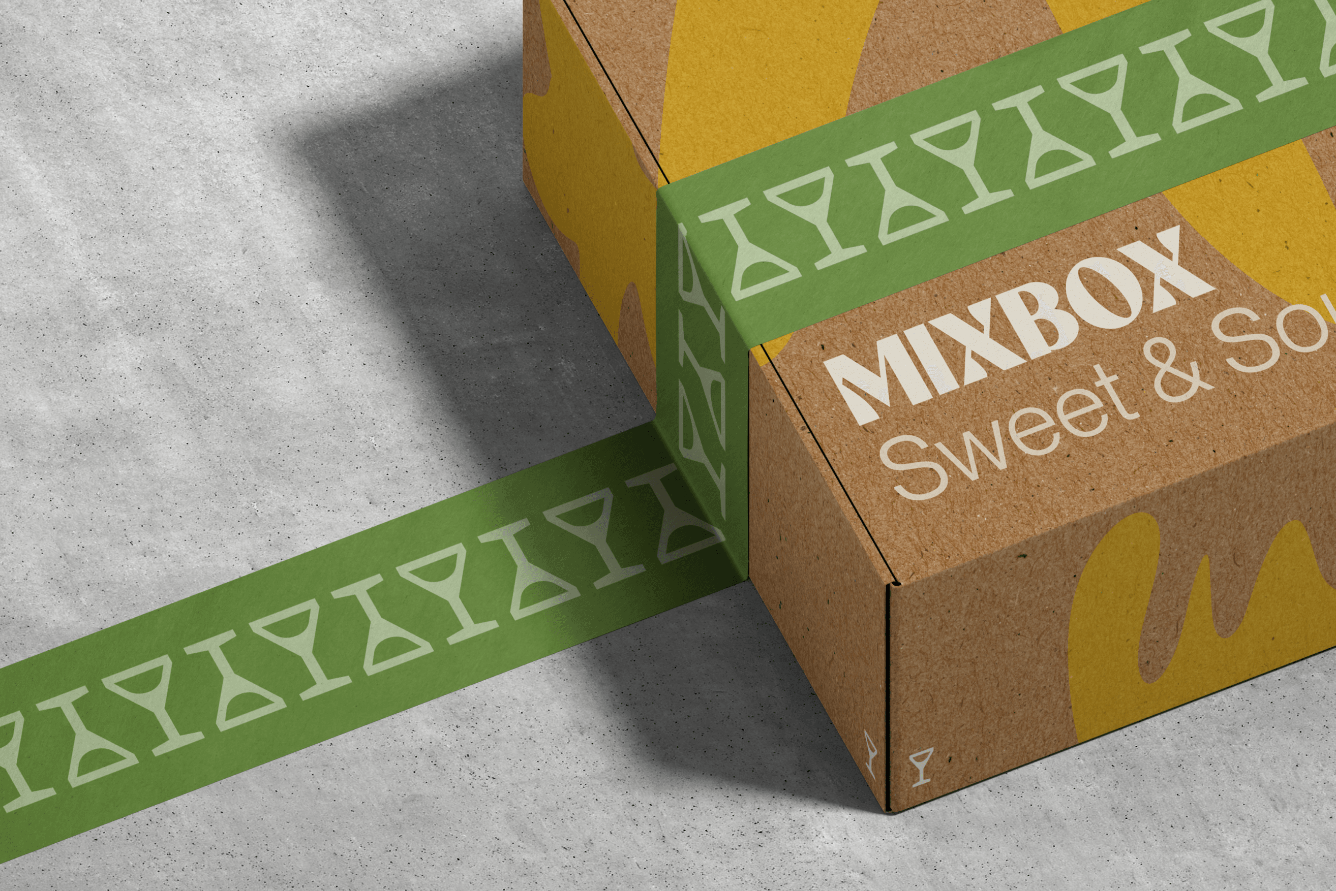
- Packaging mockups showing the monthly box design
Tone of Voice
The brand voice strikes a balance between:
- Expert knowledge (mixology terms, quality ingredients)
- Casual approachability (making cocktails accessible)
- Excitement (discovery, experimentation, social moments)
App Design Process
UX Approach
Working from provided wireframes, I critically evaluated each screen:
- Challenged existing patterns to find better solutions
- Prioritized content hierarchy for quick scanning
- Designed for context: considering when and where users interact with the app
- Added functional animations that guide and inform
- Implemented feedback loops to keep users informed
UI Design
The app became an extension of the brand experience:
- Consistent visual language across all screens
- Micro-interactions that add personality without overwhelming
- Responsive components that adapt to content
- Thoughtful color usage for visual hierarchy and mood
- Custom iconography aligned with brand aesthetics
Key Screens Designed
- Onboarding flow introducing the service
- Box management dashboard
- Recipe browser with filtering
- Individual recipe details with step-by-step instructions
- Subscription settings and preferences
- User profile and cocktail history
Tools & Process
Design Tools
- Figma: Primary tool for UI design and prototyping
- Adobe Illustrator: Logo design and vector assets
- Prototyping: Interactive mockups demonstrating user flows
Iterative Design
The project emphasized iteration based on:
- Peer feedback: Collaborative critiques with classmates
- Design critique sessions: Refining based on instructor guidance
- Self-reflection: Critical evaluation of design decisions
- Process documentation: Maintaining a clear creative journey
Design Decisions
Strategic Choices
- Target Audience Focus: Selected one primary persona from multiple options to ensure focused, effective design
- Competitive Analysis: Researched subscription service apps and cocktail apps to identify opportunities
- Accessibility: Ensured readability and contrast ratios met standards
- Industry Standards: Balanced innovation with familiar patterns users expect
Challenges Overcome
- Creating a brand that feels premium without being pretentious
- Designing an app that works for both cocktail novices and enthusiasts
- Balancing detailed recipe information with clean, scannable layouts
- Making subscription management feel exciting rather than transactional
Project Outcome
The complete brand identity package includes:
- Comprehensive brand board with design rationale
- Full logo suite with usage guidelines
- Color system with accessibility considerations
- Typography hierarchy and pairing rules
- Packaging design concepts
- High-fidelity app prototype with interactive elements
- Design system documentation
This project represents a complete brand creation process, from strategic thinking and visual identity development to detailed UI/UX design and prototyping. The result is a cohesive brand experience that makes home mixology feel both aspirational and achievable.
View the complete project on Behance to see the full brand board, app screens, and packaging designs.